Monday, December 5, 2011

Caravaggio and the Moment of Mary Magdalen


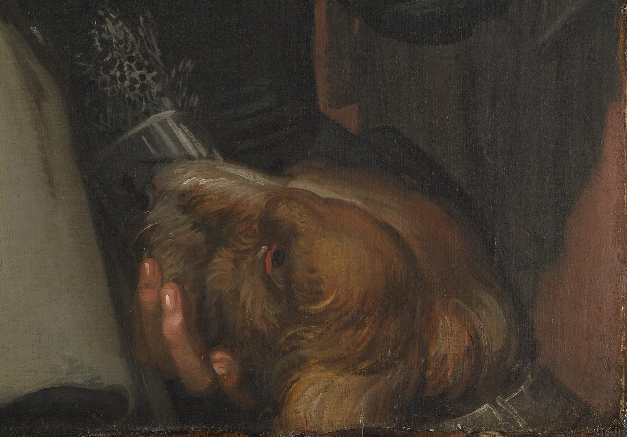
Martha and Mary Magdalene, c. 1598, shows the saint at the moment of her conversion. It is from the Detroit Institute of Arts, but is currently on view in Caravaggio and His Followers, at the Kimbell Museum of Art
In Caravaggio's remarkable version of the Mary Magdalen story, he painted the moment of her transition from sinner to saint. As much as Dan Brown's The Da Vinci Code popularized the idea that the Church demonized Mary Magdalen, more commonly she was idealized in art as a saint who turned her life around. The painter Michelangelo Merisi, who is nicknamed Caravaggio, was demonized in his lifetime for his shockingly realistic paintings and his own "sinful" life. (He was charged with murder and often on the run.)
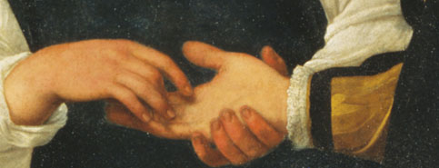
The inclusion of Martha with Mary Magdalen and other objects requires the viewer to interpret the symbolism. Martha is seated with her back to the viewer, with only one shoulder and her hands hit by Caravaggio's dramatic lighting. On the table are a comb, powder puff and mirror, symbols of vanity. Mary points to her chest holding a flower, while her other hand points emphatically to a diamond square of radiant light on the edge of the convex mirror.

The naturalistic light, seemingly projected from a window, is also a divine light, the ray of God which has inspired the worldly Mary Magdalen to "see the light." In the moment that Caravaggio highlighted and caught in paint, as if on camera, we witness spiritual transition. From this point on she will give up her luxury and prostitution to follow Jesus. By using models who resemble contemporary people in Rome, rather than Biblical characters, the viewers were supposed to identify with the personal nature of the conversion process.

Light is concentrated in a few important places: Martha's hands, Mary's face and chest, the hand and patch of light on the mirror. Sister Martha's hands are lit because she is pleading for Mary to change (and perhaps counting her sins and/or the reasons she should convert). Mary answers by pointing precisely to that light on the mirror.

Perhaps because Mary Magdalen was seen as an instrument of change, and as the most loyal companion of Jesus in his death, she was greatly idolized in the Middle Ages.
The church of Sainte-Madeleine, Vezelay, in Burgundy, was a site of her relics and one of the most important of all pilgrimage churches. However, in the late 13th century, a 3rd century Christian tomb discovered in the crypt of a church in Provence was connected to Mary Magdalen. The site of her devotion then moved to this church and another site in the delta of the Rhone, where legend claimed she had relocated after Jesus' death.

After seeing Caravaggio's painting of Mary Magdalen, I thought differently of Georges de la Tour's The Penitent Magdalen at the National Gallery. Like Caravaggio, he used a contemporary young woman as his model. Yet this contemplative scene omits symbols of vanity and the light-dark contrast comes from candlelight hidden behind a skull. As Mary looks in the mirror, the skull is reflected rather than her face, as de la Tour has artfully manipulated perspective. Lif
e as a sinner leads to a spiritual death. Death is inevitable, but if she chooses to follow Jesus she will die of the self and be reborn in new life.

Here Mary Magdalen may either be ponderin
g her fate before conversion, or thinking of her wish to be reunited with Jesus in eternity later in life. Oddly, she caresses the skull as if wanting to die, perhaps because death for a person at peace with God is ultimate goal and preferable to life on earth. The shape of the skull mimics, in reverse, the shape of her sleeve, arm and hand, showing her intimate connection to thoughts of death. In his view, we are also encouraged to ponder our actions and/or sins and consider our life in eternity. Personal faith is in important factor of both the Reformation and Counter-Reformation at this time, although only the Catholic artists would portray saints. De la Tour leaves the meaning ambiguous, unlike Caravaggio who shows a transitional moment.

Georges de la Tour, The Repentant Magdalene, c. 1635, at the National Gallery of Art, Washington, shows her in a contemplative mode, perhaps thinking of death.

In the 6th century, Pope Gregory gave a sermon suggesting Mary Magdalen had been a prostitute before following Jesus. (Of her past, the Bible refers to the seven demons Jesus cast out of her, a vague description.) Although the church usually portrayed her to show that salvation is possible to all who ask for forgiveness, the model for Caravaggio's Mary Magdalen was Fillide Melandroni, one of Rome's most notorious courtesans. Neither she nor Caravaggio--who revolutionized art in his time--seem to have undergone a spiritual revolution. Caravaggio was frequently in fights and in 1606 he appears to have gotten into a fight with another man over Fillide, this remarkable woman.

(Note: Caravaggio's more famous paintings of religious calling/conversion are The Calling of St. Matthew and The Conversion of St. Paul, both in Rome and done around 1601. This artist's life is always a fascination to the public. There is a new biography about him by Andrew Graham-Dixon, Caravaggio: A Life Sacred and Profane, which may try to explain the contradictions of his life. A biography I read a long time ago is Desmond Seward, Caravaggio: A Passionate Life.)


Sunday, November 27, 2011

Paintings of Deception

Valentin de Boulogne, Soldiers Playing Cards and Dice, c. 1618/20

A magnificent exhibition of Caravaggio and His Followers at the Kimbell Museum in Fort Wort
h features the Washington National Gallery of Art's Soldiers Playing Cards and Dice by Valentin de Boulogne. The painting tells a story of deception. Caravaggio had also painted Card Sharks with fewer figures. Boulogne, a Frenchman working in Rome, may have known of his composition.

Boulogne's painting is a tight, close-up composition with masterfully chosen areas of ligh
t. Two simultaneous episodes are taking place: dice throwing on the right and cheating card players on the left. The card sharks are the first to demand our attention, as they look startlingly real. Behind the central figure, who is in the process of cheating, another drama is happening. A man on the right looks down and covers his dice, perhaps hiding something while his adversary with the red hat seems about to erupt in anger. Although not a traditionally religious painting, Boulogne suggests two of the deadly sins, deception and anger. He warns of the hazards of gambling, exactly what these two vignettes represent.

The dice player with downcast eyes can be variously interpreted.

The sinister scene is set in a dark room. The well-dressed young man in front left is being duped by two soldiers, while two men cross behind them playing dice. The compact composition and the forceful use of diagonals heighten the tension, connecting the men who otherwise would be seen as individual character types. Colors are primarily earthy for these ruffians. But other colors fight for attention: white, scattered touches of blue clothes and the brilliant red hat in center (symbol of anger?), which is replicated in less vibrant red stockings on bottom facing the other direction.

A dark, sinister man in the upper left corner startles with his realistic presence. The details of faces come from a blog, Head for Art, May 24, 2010.

Eye movements and gestures pull us around the painting. At first glance, I am attracted to the white face and dark staring eye of the man in center (see below). His gaze goes past his competitor, to the man in shadow behind. Though the face of this man on the far left is darker than the others, his expression is so real as his fingers signal the number two (above). The shadowy compositions suggest that more than cheating is going on, something very dark, sinister and deceptive. Boulogne warns against taking chances in life. Intense light- dark contrast is a legacy of Caravaggio.

Viewers note the intensity of this soldier's stare and his slow, careful choice of cards pulls the viewer into the story.
 

Caravaggio, The Fortune Teller, of 1594, comes from the Capitoline Museum of Rome. The aristocratic young man falls in love as he is being duped.

Another allegory of deception Caravaggio painted is The Fortune Teller, 1594, a startlingly realistic depiction in the Kimbell's exhibition. An alluring young gypsy and fashionable aristocrat look at each other with an intense hold. Her face suggests she is attracted to him, or at least feigning an attraction. His puffed sleeve, puffed cheek, elbow, sway of hips and sword express confidence, but caution is thrown to the wind. As the girl reads his palm, she slyly slips off his golden ring. The viewer, captivated by the couple's loving gaze and beautiful clothing, is also tricked. We only see this detail by close inspection. The colors are primarily earth tones, black and white.


The Cheat with the Ace of Clubs, by Georges de la Tour, 1630-34. The cheat, who slyly looks at us and shows his deck, is a "shady" figure, both literally and figuratively.  The shadiness of the story is in contrast to the highly polished figures and their clothes.

Georges de la Tour's scene of card players, in the Kimbell's own collection, rounds out these tales of deception. Some elements of The Cheat with the Ace of Clubs are familiar-- its close-up view and dark background. But the colors are brilliant oranges, pinks and reds. The youngest boy will get duped, and everyone else knows they are taking advantage of him. Cheating begins with the large woman who glances sideways at the woman bringing wine, who in turn casts one eye towards the "shady" cardplayer. In shadow on the left, he holds out the cards for us to see and looks at us outside the painting, bringing the viewers into the drama. The boy on right is innocent, but flirting with a world beyond his experience. The background is completely black behind the evil threesome, while the young boy is still halfway "in the light" of the painting, midway between good and bad. He can choose to stay on the right side, both literally and figuratively.
 

Certain Baroque painters could visually portray situations comparable to the dramatizations of Shakespeare from the 1590s and early 1600s. Carefully calculated figure placements and compositional angles let the human drama unfold before our eyes. They moralize and forewarn viewers of evil. Caravaggio's Fortune Teller and de la Tour's Cheat with the Ace of Clubs also are also comedies, because the well-dressed young men, possibly aristocrats, do not realize their susceptibility to trickery.

Wednesday, November 23, 2011

From the Childhood of Michelangelo


St Anthony Torment by the Demons, c. 1487, was painted by Michelangelo when he was only 13. The panel, 18 x 12 inches, is warped as happens to many panels over time.

The Torment of Saint Anthony is a small panel painting which was recently discovered to have been painted by Michelangelo in 1487/88. Intensive cleaning in 2008/9 led experts to believe that Michelangelo painted it when he was 12 or 13 years of age. Only four easel paintings by Michelangelo are known, and this one of is in North America, at Fort Worth's Kimbell Art Museum.

Michelangelo's St. Anthony looks remarkably calm despite the demons who are scratching him

St. Anthony was an early Christian of the 4th century who lived as a hermit for many years. According to his biographer, the rigorous asceticism practiced by St Anthony in the Egyptian desert allowed him to float in the air, where he was attacked by devils trying to beat him to the ground. Anthony defeated these demons on more than one occasion, but not without a big struggle. It is not at all surprising that a young Michelangelo would have been attracted to this subject, because the artist always seemed to be battling his own internal demons, as the poetry he wrote and certain sculptures of slaves he made later in life would suggest.


Schongauer's masterly engraving, St. Anthony Tormented by Demons, c. 1480, gave inspiration to the young Michelangelo
Michelangelo copied an engraving by a French-German artist, Martin Schongauer, who was Europe's greatest practitioner of printmaking at that time. Schongauer used a vivid imagination and great technical ability to show light, shadow and texture. These beasts are composite creatures of fanciful reptiles, fish and flying monsters, who scratch, pull and club the holy man. Schongauer left the landscape minimal, a small edge of rocks in the lower right-hand corner which describe the mountain he lived on in isolation. Saint Anthony seems to be suspended in the air, in a radiating, circular composition. Schongauer used short dots or stipples to get his deepest shadows into the small metal plate used for engraving.

We don't know the date of Schongauer's engraving--perhaps about 1480--but we know that his prints traveled throughout Europe. Michelangelo's biographers said that he made a painting after a Schongauer print when he was 13, and this new attribution fulfills that void in our knowledge. This connection also shows the important role of prints in spreading artistic ideas and iconography, with the engraving passed into Italy from Germany.I have seen the Schongauer original in the print room of the National Gallery and its details are incredible. No wonder the young genius was impressed.

Although Michelangelo borrowed many details
from the great German engraver, he went to
the fish market to observe. According to the
Kimball Art Museum, Michelangelo scraped away
lines of paint in the body of the fish-like creature,
revealing the primer beneath the paint in the
parallel lines of hatching.

When Michelangelo copied Schongauer, he was equally adept at detail. He straightened Saint Anthony's head, gave him a shorter beard and added an interesting landscape background. The brown-gray foreground is rocky and craggy, and in pristine detail. Critics of the Michelangelo attribution do not like the background. The painting has a high viewpoint just like St. Anthony who lived on a mountain near the Nile when the demons attacked and lifted him. So this landscape is a bird's eye view of river, hills and sky with a low horizon line. Using aerial perspective, it gets more and more indistinct as it goes back into space and turns nearly white as it hits the horizon. The cool colors of the background and the low horizon line allow the figures to come forward and stand out with warm colors. This setting may be more reminiscent of the Arno in Florence than the Nile River, but European artists of the time were not familiar with the desert.

Photos above and right were taken by the Kimball to AP. This demon was painted in tempera and oil with magnificent detail. Color changes and the meticulous line technique are visible.
His mouth is ferocious.


Tuesday, November 8, 2011

Forget Andy Warhol; Go to the Newseum

The Newseum in Washington, DC, opened near the Mall in 2008. This 7-floor, 653 square-foot building on Pennsylvania Avenue is a museum of photographic, print and broadcast journalism. Its architecture combines ultra-sleek glass with reinforced concrete.

Instead of going to the National Gallery's exhibition, Andy Warhol: Headlines, a trip to the Newseum across the street to learn about real headlines and the history of journalism would be more worthwhile. Warhol had a need for publicity, but that does not make his art interesting and real life news deserves more of the public's attention. The 14 galleries and 15 theaters involve many historic events. A few news programs are broadcast here, including This Week.

Seeing a Warhol in person offers nothing new, unless the colors are wrong in reproduction. Size is the only difference between a real Warhol and a reproduction, but big does not make the art good. A concurrent Warhol exhibition at the Hirshhorn has very large pieces.

In contrast to most large National Gallery exhibitions which are teaming with visitors who can't get their eyes off the paintings, prints or sculptures, a Warhol show gets visitors who walk through the exhibitions without stopping to look very frequently. On the Sunday I was there, no one had bought the $5 acoustiguide.
The photo above is from Wikipedia
Why has the National Gallery mounted a Warhol exhibition? Very wealthy collectors who had been lured into the hype have paid $18 million plus for his works, investments which could be worth little in 100 years. A recent news flash showed that actress Sandra Bullock's son received the gift of a Warhol print; even a one-year old baby is learning to be fashionable. While working at a blue chip Chicago art gallery (not as trendy as Hollywood or New York) in the 80s, I saw how some collectors buy to be in style or flaunt their prosperity rather than for love or interest in art. Collecting Warhol is often for people who fall prey to these scenarios.

A recent PBS
documentary about Warhol showed how many of his ideas were not his own ideas, even the soup cans. Contrary to the myth Warhol perpetuated, he was not the inventor of Pop Art. Better than going to a Warhol exhibition, one is advised to watch the PBS show on DVD or watch his imitators, today's reality trendsetters on TV.

Furthermore, he has completely done a disservice to artists by suggesting that the shallow, narcissistic and capitalistic instinct should be cultivated as art.

Before giving Warhol attention, we should recognize the drug culture he created with many young women and men at The Factory in New York, where workers help him mass produce images. The terrible addictions and deaths that some of these "groupies" experienced should not
be disregarded, as he promoted behavior influencing their demise in order to cultivate followers. Warhol received too much attention in his life and he does not deserve it now.

Instead of looking at his uninspired work, viewers should gaze at some of the stunning photojournalism in the Newseum, works of visionary power and depth which can be both illuminating and moving to viewers. The "Pictures of the Year" exhibition just closed. However, a traveling exhibition of Pulitzer-Prize winning photographs is on view through December 2011.

If you disagree, please feel free to comment on this blog and explain why his art has any value. If Andy is genuinely important, there will be persuasive argumen
ts in Warhol's favor. But if Warhol defenders don't come to the rescue, you will prove my point --- that the public should stay home and avoid these exhibitions. Writing your differences of opinion, just like freedom for artists to express themselves, is all important!

The Newseum is funded by Freedom Forum, a non-partisan group group dedi
cated to freedom of speech, freedom of the press and free spirit for all people. Its mission is "raise public awareness of the important role of a free press in a democratic society" and bring understanding between the public and the press. Like other institutions these days, it has hit hard financial times (isn't it time for the price of an Andy Warhol to go down?) and staff had to be cut. The price of admission is now $21.75. But exhibits are interactive and you can spend an entire day there.

Finally, the true artist is one who would do art regardless of fame or fortune, someone like Van Gogh who sold no paintings in his lifetime but whose art truly moves people to this day. In a hundred years, Warhol will be forgotten because his art is lacking.
Here is a blogger who also has poor things to say about Warhol:

http://www.huffingtonpost.com/john-seed/warhol-soup-cans-analysis_b_894140.html

Wednesday, November 2, 2011

Layering Paint

Georgia Nassikas's triptych, Stone Wall, is in the very old technique of encaustic..

McLean Project for the Arts is currently exhibiting three contemporary artists whose techniques involve layering. I was initially attracted there to look at Georgia Nassikas' paintings made in an encaustic technique. In this medium, paint pigment mixes with beeswax to create a very thick and rugged texture, as seen in Stone Wall, above. Paint must be kept hot during application and it sets quickly. The technique was introduced in Egypt during the Roman Empire, in portraits of the deceased encased in mummies. Nassikas uses the wax from the hives of bees she keeps, as it is necessary to cover the large areas of the multi-layered canvases she paints. Many diverse, uneven shades of color show through the wax in both abstract and landscape paintings.

Carolyn Case has small intimate paintings of oil which also feature layering of a different kind. Her exhibition is called Accidently, On Purpose, suggesting the the works are spontaneous. However, portions of her paintings seem to be cut out or stenciled with different patterns. Even if we cannot figure out how she gets her multi-layered effect with different colors and patterns appearing in front and behind each other, we can get lost in the intricacies and details of her paintings.


Carolyn Case's intimate paintings are 12" x 12"
They are Part Potion, left, and Blue vs Blue, right, featuring multiple layers

Finally, Seth Rosenberg's paintings do not have the layers and textures of paint that Carolyn Case and Georgia Nassikas give to their oils and encaustics. However, his paintings from the "Cleveland Years: 2005-2009" give the illusion of overlapping of abstract and realistic forms.
Hard Times represents the muted colors from Seth Rosenberg's Cleveland years, a change from the colorful style of his Washington years.
He mastered making compositions which combine several different patterns in single paintings which resemble collages. Colors are minimal, almost monochromatic. This artist lived in Washington, DC, for twenty years, but spent five years in Cleveland until his sudden death in 2009. The Rosenberg exhibition originated at the Cleveland Museum of Contemporary Art. Kudos to a small community art center, McLean Project for the Arts, for bringing in such a good traveling exhibition.

Thursday, October 6, 2011

Degas's Dancers at the Barre


Two Dancers at the Barre, early 1880s−c. 1900, Oil on canvas, 51 1/4 x 38 1/2 in. The Phillips Collection, Washington, D.C. Acquired 1944. This painting is the centerpiece of the current exhibition.
Point....Flex.....Relevé-----these themes of ballet dancing were the obsession of Edgar Degas, an artist associated with Impressionism but known for his paintings and pastels of dancers. Washington's Phillips Collection recently put their large painting, Dancers at the Barre, under their conservator's care. In the process, they discovered wonderful color and took a deeper look into the process of this artist. The exhibition Degas' Dancers at the Barre: Point and Counterpoint transports the viewer into Degas' mind and back into the opulent Garnier Opera House which opened in Paris in 1875.

Most of the paintings, drawings and studies in the exhibition feature women, mainly ballerinas. After viewing the show, I once again get the feeling that Degas is the foremost among arti
sts in his understanding of the strength of the female body, just as Michelangelo leads all artists in the understanding of the male bodies. However, unlike Michelangelo, Degas did not demonstrate knowledge of musculature or make his figures sensual. At times he appears to negate the underlying anatomy and distort in order to show the body's expressive possibilities.
Ballet Rehearsal, c. 1885–91. Oil on canvas, 18 7/8 x 34 5/8 in. Yale University Art Gallery. Gift of Duncan Phillips, B.A., 1908 The composition is asymmetric, typical of Edgar Degas.
Degas's compositions are about contrast: left and right, point and counterpoint, up and down, orange and blue-green, line and shape, solid forms but with diaphanous clothes, stability and movement. He portrays movement with color and with spontaneous, oblique compositions, allying him with the Impressionists. He exhibited with them from 1873-1886. Arguably, Degas was the greatest of all draftsman during the 2nd half of the 19th century, a time of tremendous artistic creativity.

Degas's studies of dancers reveal his desire to understand and express the outward effects of stretch and stress, not inner musculature. At this time, ballet was not the idealized performance art we imagine. Instead young girls worked long hours under difficult conditions, with much
strain on their youthful physiques. Under Degas' interpretation, we witness the precision and tour de force of their labors. He drew and painted the rehearsals more frequently than actual performances. In Degas's early paintings, the viewers admire the dancers' poise and balance, as they move into difficult positions. In later works, such as the signature piece of the exhibition, we see much contortion and distortion, somewhat like a Cirque du Soleil performance. Through Degas's drawings, paintings and pastels, we do not necessarily appreciate the body's outward beauty, but we understand its possibilities, flexibility and the strength of human effort. The bodies' movements are gestural and evoke strong feelings.
Dancer Adjusting her Shoe,1885, Pastel on paper, 19 x 24 in. Collection of The Dixon Gallery and Gardens, Memphis, Tennessee; Bequest of Mr. and Mrs. Hugo N. Dixon, 1975.6. Drawings repeat poses in his paintings and often show changes of the artist's mind.
Degas is unique amongst the Impressionists in the strength of his line. Outlines at times contrast with the soft tutus of transparent colors. But his colors are sometimes brilliant, particularly oranges and blue-green. There are also vivid bows of pink, yellow, orange and red. He is superb at using color contrast to create light and shadow. Degas painted mainly indoors, but he used natural light from windows to sparkle on his dancers.

He normally works with off-center compositions, an effective foil to the dancers in their shoes. His asymmetry is like the fragile balance of the ballerinas on the tip of their toes: it can be a precarious balance. Th
e art of the ballerina is to remain strong and poised in difficult positions, and Degas balanced his asymmetric compositions artfully, which was equally a challenge.

In a nearby gallery are the works of other artists, such as Manet's Spanish Ballet. S
culpture helped Degas refine his vision and the exhibition includes 3 bronze-cast sculptures. Like any great artist, he worked on the same themes over and over, same pose with slight differences. Several late works are pastels, a ideal medium for his methods. The Phillips' exhibition also runs a filmed performance of Swan Lake.Hilaire-Germain-Edgar Degas, Two Dancers Resting, c. 1890–95, Charcoal on paper, 22 3/4 x 16 3/8 in. Private Collection.

Monday, October 3, 2011

Painterly Pleasures


Frans Hals, Young Man and Woman at Inn, 1623 Metropolitan Museum of Art


Willem de Kooning, Merritt Parkway, 1959, from the Detroit Institute of Art, Bequest of Hawkins Ferry, is in an exhibition at the Museum of Modern Art (called MoMA), New York
At first glance, Frans Hals and Willem de Kooning have nothing in common, other than being artists who originally came from the Netherlands. More than three hundred years separate their art and two very different New York Museums, the Met and MoMA, have exhibitions of their work. Hals was vividly realistic and de Kooning was a founder of Abstract Expressionism, but their common grounds are looseness of brushwork, luscious paint and bold energies going in all directions. In short, it is their painterly techniques.

Women, II, in MoMA, part of the Blanchette Hooker Rockefeller Collection, is one of many paintings of women that de Kooning did in the 50s

Analyzing the radiating diagonals of Hals' compositions and paint quality, we might wonder if de Kooning 's thick, diagonal brushstrokes, sometimes overlapping and transparent, were inspired by Frans Hals' compositions. Both artists give the viewer a texture we would want to touch.

Frans Hals, detail of woman, from Young Man and Woman in an Inn
And then there is color; in Hals, it's the beautiful blue sleeve and feathers of the man leaving a bar and the flushed cheeks of a woman grabbing his arm. Hals soaked her cheeks with redness from too much drink, but at a time when artists did not exaggerate color. Perhaps a coincidence, but de Kooning, particularly in paintings of women, dared to make the reds quite strong. Women, II, shown above, also has a tactile quality to its blues, greens, red and white.

The soft and furry dog is typical of Hals' ability to paint wonderful, tactile effects

In Young Man and Woman at the Inn, we witness Hals' desire was to create a snapshot of time, a vivid realism that looks fresh and unplanned. He used a close-up view, a foreshortened upper arm and a jump into deeper space. The arm holding a glass pokes out of the picture frame. This view looks spontaneous, as if the couple did not know they're being caught by the artist. A dog in the lower right hand corner completes Hals' soft, painterly picture. This Dutch master is known mainly for his portraits.

De Kooning, on the other hand, immigrated to the United States and made his fame with the New York School, the Abstract Expressionists of the mid-20th century. The Met's show of Frans Hals will end soon, but MoMA's very large exhibition of de Kooning will continue until January 9.

Thursday, September 8, 2011

Pioneer of Video Art: Nam June Paik

Electronic Superhighway, 1995,a gift from the artist to the Smithsonian American Art
Museum, Washington. This 49-channel installation is neon, steel and other electrical parts.
In the Tower: Nam June Paik is at the National Gallery of Art until October 2nd. This Korean-American artist introduced the realm of tv/video art with sculptures made of televisions in 1966. The exhibit encompasses themes and ideas important to art of the last 50 years.

His last video sculpture made in 2005, Ommah (mother in Korean) uses a 100-year-old boy's robe, hanging like a cross, with a projection of Korean-American girls at play, linking past and present. It is in the National Gallery's permanent collection

To fully appreciate his work one must see the exhibition in the museum's East Wing. His art is about tv/video, a relatively new medium in visual art. A room of Paik's drawings accompany the exhibition and help the viewer understand his thought process. One of the most interesting takes us back to the 60s culture; it's a drawing of the Pan Am domestic routes represented by bunny-eared TV icons connected by red lines. He seems to have projected that many networks of our lives have been influenced by TV, and perhaps have changed us.

Paik, who died in 2006, is credited with bringing this medium into the realm of contemporary art. Compared to other video artists (there are many today!), Paik is certainly a multimedia artist who thought more in terms of how television and its relatives can be incorporated into art, rather than end and aim of the art itself.

One Candle, Candle Projection, 1988-2000 candle, candle monitoring device, closed circuit camera, projectors, distribution amplifier, and 5" color monitor, dimensions variable Nam June Paik Estate
© Nam June Paik Studios, Inc. 2010
He used knowledge of technology and contemporary art to reflect on traditional cultural identities. He was vastly concerned with bringing together aspects of the past with the present. One Candle, One Projection, 1988-2000, is the centerpiece of the exhibition, and one can only grasp its power by experiencing it in the large, dark exhibition room. The dim lighting of the viewing space is ideal for the meditative concepts here. A single candle is lit everyday and a multiplicity of projections move, flicker and interact as the viewer is invited to watch. Time, or the passage of time, is of the essence.

In seeing the Paik exhibition, I appreciated this modern artist's ability to think about the contemporary aims of the society within which he was working and then make a statement. Personally, he disliked the passivity of television but could not ignore its influence on culture. In an ironic play on this notion, his Standing Buddha with an Outstretched hand is a meditation on the act of watching, using a traditional bronze sculpture as a backdrop to the modern technology. Time passes, but the statue stays the same, and Paik effectively made a statement on the meaning of television in life while connecting it to traditional meditation. Paik was trained a a classical musician and was friends with John Cage.

Three Eggs, 1975-1982
video installation with closed circuit camera, Sony KV-4000 Color Television Receiver, emptied Sony KV-4000 Color Television Receiver, and 2 hen eggs

Nam June Paik Estate
© Nam June Paik Studios, Inc. 2010
Like 20th century artists of the Dada, Surrealist and Conceptual movements, his Three Eggs reflects on the question of what is real and what is image. Three Eggs is 1) a video camera projecting on an egg; 2) a tv screen showing the projected image of this egg, and 3) a tv monitor with the screen removed-- replaced by an egg. There is irony and humor, but the passage of time is important to these 3 images, as well, having been made over 7 years. It reminds the student of Joseph Kosuth's One and Three Chairs or Rene Magritte's Treason of Images, 1929, works found in most art history textbooks.

Saturday, July 23, 2011

Kandinsky and Kindred Spirits

The Phillips' Kandinsky exhibition centers around this painting from
the Guggenheim, Painting with White Border, 1913. It appears primarily
abstract, but has two specifically Russian iconographic references: a troika
(three horses) and St. George and the Dragon.

The Phillips Collection's current exhibition on Kandinsky not only provides insight into the thought process of this giant of early 20th century abstraction, but it also gives us a chance to compare the artists with whom he worked and influenced.

The Kandinsky exhibition is juxtaposed next to an exhibition of contemporary artist Frank Stella, whose sculptures are influenced by music of Domenico Scarlatti, called Stella Sounds. The metal and plastic sculptures point, poke off the walls and into space curving vigorously with color. They become 3-dimensional expressions of abstraction comparable to Kandinsky.

Frank Stella's K43 comes out of the wall and into space. His sculptures
on view at the Phillips are based on the Sonatas of Italian composer Domenico Scarlatti

Both artists were inspired by music and Stella admits his appreciation for Kandinsky. Kandinsky named most of his early abstract paintings with titles suggestive of music: Improvisation, Composition, Impression, followed by a number. Ironically, the Phillips calls its exhibition Kandinsky and the Harmony of Silence: Painting with a Large White Border. The white border may be silent and restful, but the rest of this large painting has a rich depth, as each strong color pushes into space and clamors for attention.

The Phillips exhibition is educational, showing his drawings and his working process. Included is Sketch 1 for Painting with White Border (Moscow), a major holding of The Phillips Collection, as well as ten other preparatory studies in watercolor, ink, and pencil. But even more instructive is putting Kandinsky in perspective with his colleagues in two German art groups, the Blaue Reiter and the Bauhaus. If the great Russian painter and philosopher was the spiritual leader amongst the abstract artists centered around Munich, their spokesman, it is fitting because his art is the brashest and most assertive of the group.
The Phillips Collection has a superb painting by Franz Marc, Deer in the Forest, II. Looking forward to environmentalism, this painting hints at the destruction of nature in the 20th century. Unfortunately the artist himself died in World War I.

The Phillips owns many paintings done by Kandinsky's colleagues : Franz Marc, the other leader of Der Blaue Reiter (The Blue Rider) who died in World War I; the nervous Austrian, Oskar Kokoschka; the whimsical, childlike but sophisticated Paul Klee, and the playful American-German Lyonel Feininger. It's a special treat to see the other early masters of Expressionism.

Lionel Feininger's Village is a geometric construction of shifting planes of color.

Beginning in 1922, Kandinsky taught at the Die Bauhaus, a comprehensive art and design school. Paul Klee was one of his colleagues there, as well as in Der Blaue Reiter. Klee's art is as abstract, automatic and free as Kandinsky. But his vision is more subtle, more simple and more symbolic. Having at least 5 paintings by Klee to compare, we clearly see the difference.
Paul Klee,Tree Nursery, 1929, is one of several Klee paintings on view to compare with Kandinsky. In Klee's paintings--not Kandinsky's - we see the harmony of silence.
One of the great strengths of this Washington museum is its commitment to comparative exhibitions which give the viewer a fuller understanding of individual artists. Fortunately, the Phillips already has a large collection of early Modernism to supplement its exhibitions. The Kandinsky and Stella displays will be on view until September 4.

Thursday, April 7, 2011

The Caryatids Have Hair - Lots of it!

Six famous women hold up the Porch of the Maidens of the Erechtheion, a temple on the Acropolis of Athens. These statues are admired for their graceful poses and drapery, but who notices the hair? An Art Historian who specializes in the sculpture of the Acropolis, Katherine Schwab, has studied the hairstyles and made a project of it for her students at Fairfield University in Connecticut. Here's a summary of a presentation she gave last night at the Greek Embassy in Washington.


In the New Acropolis Museum, Athens --which was just built a few years ago -- one can see the statues from the back with their beautiful long braids of hair, falling in fishtails followed by more curls. In fact, the hair of the statues is in better condition than the faces and bodies whose arms are completely missing. (Caryatid is the name given to a feminine statue which acts as a column to hold up a building; Kore is a statue of a maiden.)

These six caryatids are

labeled Kore A - Kore F.


Every hairstyle is a bit different. Most have fishtail braids down the back, along with regular braids wrapped around the head. Some of the caryatids have sidecurls, while others do not. Professor Schwab did the Caryatid Project with hair stylist Miloxy Torres who recreated the braids on 6 students, all of whom had long, thick and mainly curly hair. The students acted out the caryatid poses other at the Fairfield University campus in 2009.


 The Porch of the Maidens adorns the Erechtheion which honors Athena, Poseidon, and two legendary kings Erechtheus and Krekops.  It is an unusual building in many ways: three porches of different sizes going out in different directions.  It was of special civic and religious significance to the ancient Athenians, because it marked the site of the contest between the god of the sea, Poseidon (Neptune) and Athena, goddess of war and wisdom, for control of Athens.  In that competition presided over by legendary King Kekrops, Poseidon's Neptune struck a hole on a rock to bring forth a spring of salt water.  Nearby, in front of the building, Athena miraculously brought to life an olive tree. Athena's gift was deemed greater and she became the ruler of Athens.  One portion of the Erechtheion contains a wooden statue of Athena which fell from heaven during the reign of Erechtheus, but the Porch of the Maidens stands over the hole where Poseidon tapped his trident.
The original caryatids are now on view in the New Acropolis Museum, Athens


The photos are from the Caryatid
Project and Wikipedia. For more information and a video, see
www.fairfield.edu/caryatid                                Here's the video

Tuesday, April 5, 2011

Gauguin's Shame and Salvation

Paul Gauguin was impressed with the sincere, unspoiled piety of women from Brittany, where he painted in 1887. He placed the Yellow Christ, 1889, in a Breton landscape.
Paul Gauguin, an early modern rebel against western culture, is influenced by religious culture like his French forebears who painted for kings and churches 400 years earlier. After seeing the Art Institute of Chicago's exhibition of Early Renaissance Art in France, I saw the Gauguin exhibition at the National Gallery. Many of Gauguin's subjects also had religious themes. He put the Crucifixion in a setting of yellow and ocher pigments, and blended it into the landscape of Brittany, a region he respected for its piety and cultural backwardness at that time.

The standing woman in Delectable Waters, above, has the shame of Eve being expelled from the garden of Paradise. We don't know her relationship to the other women, although they also seem to live in a lush tropical place, much like a Garden of Eden

Many of the paintings in Gauguin: Maker of Myth come from his Tahitian stay after 1891. He treats several scenes of Tahitian women and gods through the lens of Christianity and other religious traditions. It's curious that the moon goddess Hina who appears in Delectable Waters, above, is actually in a pose from Hinduism that Gauguin morphs into this Tahitian image. In some canvases the Tahitian women, rather than Eve, deal with evil and temptation. He portrays human dramas of guilt, fear, agony and pain.

Why Are You Angry, from the Art Institute of Chicago, has always fascinated me. It also seems to have a mysterious theme of guilt or shame. This encounter between a standing lady and two seated girls who humble themselves creates a provocative drama separated by an old woman and a tree. Each woman is strongly modeled with lovely, brownish skin tones. The colors of this paradise blend warm hues of yellow and red with the cool, peaceful colors of mauve and blue.

Why Are You Angry, from the Art Institute of Chicago, exemplifies Gauguin's ability to balance the warm and cool colors of nature, while the composition is balancing the various sides of the human drama .

Even before going to Tahiti, he painted of Christ's Agony in the Garden, showing Jesus is a human who feels the same pain of rejection that we, as humans, do. He uses his own face as Jesus Christ. Bright red-orange hair is symbolic of the fire and pain of human suffering, which we see not only as Jesus but part of humankind. There are many self-portraits on view. Symbolist Self-Portrait from the National Gallery's collection, shows the paradox of his own good and evil natures, making his choices appear like Adam and Eve's. More powerful than ego promotion, these self-portraits are powerful expressions of the human dilemma. After all, he started out as a stockbroker, which clearly did not work for him. The exhibition has an impressive display of Gauguin's sculpture and ceramics, even in self-portraiture.

The Agony in the Garden, is a Christian theme. Here Gauguin has given Jesus his own face, suggesting that he empathized and identified with the suffering of Jesus.
One can wonder if Gauguin ever overcame his pain, shame and reached a type of salvation in his final destination, Tahiti. Whether it was Eden, Tahiti or Gethsemane, he seems to paint so many gardens, the paradises for which he hoped. (He had spent a childhood in Peru, traveled to the island of Martinique, to the opposite corners of France, Brittany and Arles, in search of simplicity before arriving in the South Seas.) Curiously, there are no paintings representing his short stay in Arles with Vincent Van Gogh.

In the end, Gauguin leaves his meanings ambiguous, but color is Gauguin's salvation as an artist.

Two Women
, above, from the Metropolitan Museum of Art, shows Gauguin's gift of color--not only yellow sky and brilliant red cherries. The woman to the right is painted with green hues beneath her brown skin, a wonderful match for her blue dress, while the other women has red under brown skin.